Loading...
ArchiveProduct
How to Design SaaS Reporting Features That Provide Real Value Instead of Vanity Metrics
This is an archived article from the previous version of this site. It is preserved here for reference.
In the world of data analytics, distinguishing between real value metrics and vanity metrics is crucial for any business, especially in the Software as a Service (SaaS) sector. Real value metrics provide actionable insights that drive growth and improve user experience, while vanity metrics may look impressive on paper but fail to contribute meaningfully to the business's objectives.
For instance, tracking the number of downloads or sign-ups can be enticing, but if those users do not engage with the product or convert into paying customers, the numbers become little more than a hollow achievement. Understanding this difference allows me to focus on metrics that truly matter. I have learned to prioritize metrics such as customer lifetime value (CLV), churn rate, and user engagement levels over superficial figures like total downloads.
By honing in on these real value metrics, I can better assess the health of my SaaS product and make informed decisions that align with long-term goals. This shift in perspective has not only enhanced my analytical skills but has also fostered a culture of accountability within my team, where we collectively strive for meaningful growth rather than just chasing numbers.
Key Takeaways
- Real value metrics focus on meaningful and actionable data, while vanity metrics are often superficial and do not directly impact business outcomes.
- Key performance indicators for SaaS reporting should be aligned with the company's strategic goals and provide insights into user behavior, product performance, and revenue generation.
- Customizable dashboards allow users to tailor their reporting needs, providing relevant and personalized insights for informed decision-making.
- Data visualization techniques such as charts, graphs, and heat maps help to present complex data in a clear and understandable format for actionable insights.
- Predictive analytics can help in forecasting trends and patterns, enabling proactive decision-making and strategic planning for business growth.
Identifying Key Performance Indicators for SaaS Reporting
Identifying key performance indicators (KPIs) is a fundamental step in effective SaaS reporting. I have come to realize that KPIs serve as the compass guiding my business strategy and operational decisions. The challenge lies in selecting the right KPIs that align with my specific business objectives.
For instance, while revenue growth is a critical KPI, I also consider metrics like monthly recurring revenue (MRR), customer acquisition cost (CAC), and net promoter score (NPS) to gain a holistic view of my business's performance. In my experience, it is essential to tailor these KPIs to reflect the unique aspects of my SaaS offering. For example, if my product is designed for small businesses, I might focus on metrics that highlight user retention and satisfaction rather than just revenue figures.
This approach allows me to create a more nuanced understanding of how my product is performing in the market. By continuously revisiting and refining these KPIs, I ensure that they remain relevant and provide valuable insights that drive strategic initiatives.
Designing Customizable Dashboards for User-Specific Reporting Needs

Creating customizable dashboards has become a priority for me as I strive to meet diverse user needs in reporting. I understand that different stakeholders require different insights; what is crucial for a marketing team may not hold the same significance for a product development team. Therefore, I have invested time in designing dashboards that allow users to tailor their views according to their specific requirements.
This flexibility not only enhances user experience but also empowers teams to make data-driven decisions based on the metrics that matter most to them. In practice, I have found that incorporating user feedback during the design process is invaluable. By engaging with users and understanding their reporting needs, I can create dashboards that are intuitive and relevant.
For instance, I might include drag-and-drop features that allow users to rearrange widgets or select which metrics they want to display prominently. This level of customization fosters a sense of ownership among users, encouraging them to interact with the data more frequently and derive actionable insights from it.
Utilizing Data Visualization Techniques for Clear and Actionable Insights
Data visualization plays a pivotal role in transforming complex datasets into clear and actionable insights. I have learned that presenting data visually not only enhances comprehension but also facilitates quicker decision-making. By utilizing various visualization techniques—such as charts, graphs, and heat maps—I can convey information in a way that resonates with my audience.
For example, using line graphs to illustrate trends over time allows stakeholders to grasp changes at a glance, making it easier to identify patterns and anomalies. Moreover, I have discovered that effective data visualization goes beyond mere aesthetics; it requires thoughtful design principles. I strive to ensure that my visualizations are not only visually appealing but also informative.
This means choosing the right type of chart for the data being presented and avoiding clutter that could distract from the key message. By focusing on clarity and simplicity, I can create visualizations that empower users to draw meaningful conclusions and take informed actions based on the insights provided.
Incorporating Predictive Analytics for Proactive Decision Making
Incorporating predictive analytics into my reporting framework has been a game-changer for proactive decision-making. By leveraging historical data and advanced algorithms, I can forecast future trends and behaviors, allowing me to anticipate challenges before they arise. For instance, by analyzing user engagement patterns, I can predict potential churn rates and implement retention strategies proactively rather than reactively addressing issues after they occur.
This forward-thinking approach has not only improved my strategic planning but has also instilled a culture of innovation within my team. We are now more inclined to experiment with new features or marketing strategies based on predictive insights rather than relying solely on past performance. This shift has led to more agile decision-making processes, enabling us to adapt quickly to changing market conditions and user needs.
Integrating User Feedback and Iterative Design for Continuous Improvement
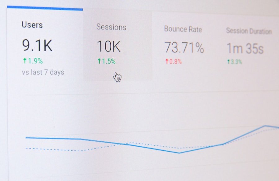
Integrating user feedback into my reporting features has become an essential part of my iterative design process. By actively soliciting feedback through surveys, interviews, and usability testing, I can gain valuable insights into how my reporting features are being utilized and where improvements are needed.
This iterative approach allows me to make incremental changes based on real user experiences rather than assumptions. For example, if users express difficulty in navigating a particular dashboard feature, I can prioritize enhancements that address those pain points. By continuously refining my reporting tools based on user input, I not only improve the overall user experience but also foster a sense of collaboration and trust between my team and our users.
Ensuring Data Security and Compliance in SaaS Reporting Features
As I develop reporting features for my SaaS product, ensuring data security and compliance has become a top priority. With increasing concerns about data breaches and regulatory requirements such as GDPR and CCPA, I understand the importance of safeguarding user information. Implementing robust security measures—such as encryption, access controls, and regular audits—has become integral to my development process.
Moreover, I have made it a point to stay informed about evolving regulations and best practices in data security. This proactive approach not only protects my users' data but also builds trust in my brand. By clearly communicating our commitment to data security and compliance through transparent policies and practices, I can reassure users that their information is safe while enhancing our reputation in the market.
Measuring the Impact of Reporting Features on User Success and Business Growth
Finally, measuring the impact of reporting features on user success and overall business growth is essential for understanding their effectiveness. I have learned that tracking how users engage with reporting tools can provide valuable insights into their success with our product. For instance, if users frequently access specific reports or dashboards, it may indicate that those features are contributing positively to their experience.
Additionally, correlating usage data with business outcomes—such as increased revenue or improved customer satisfaction—allows me to assess the return on investment for our reporting features. By analyzing these metrics over time, I can identify trends and make informed decisions about future enhancements or investments in reporting capabilities. Ultimately, this focus on measurement ensures that our reporting features continue to evolve in ways that drive both user success and business growth.
If you are interested in learning more about how businesses are adapting to the new normal of remote work, check out this insightful article on The Rise of Remote Work: How Businesses Are Adapting to the New Normal. This article discusses the challenges and opportunities that come with remote work and provides valuable insights into how companies are adjusting their strategies to thrive in this new environment.